Customizing the author experience in WordPress

Introduction
Do you remember MySpace? You might have some fond memories of it, and the endless options it provided us to customize our own pages —but if we’re being honest, the vast majority of those pages were just awful. Giving people more options seems like it should be a great thing, but sometimes more options is just overwhelming, and most combinations of design options you come up with are likely to take your site in the wrong direction. Unless you have a lot of design and editing experience, you’re probably not going to find the few good ones.
Times have changed since then. MySpace is long gone. Today, over a third of the internet is running on WordPress. While not every WordPress theme in the world is a masterpiece, it’s a far more restrained and disciplined ecosystem. There is a bit of a MySpace-esque problem brewing in the WordPress world, though. It isn’t coming from the themes this time, but from the authoring experience.
Designing for authors, not just for readers
WordPress themes make it easy to create a great user experience for your readers, and custom themes make that experience an integrated part of your branding and visual identity. But authors and editors are important users, too, and we need to think about their experience as well. Ultimately, the success of your website depends greatly on the success of these users, without whom the site quickly goes stale. The harder it is for them to work, the less work they’ll be able to accomplish, and the more your site will suffer. Content strategists and UX designers should talk to content authors about their needs to design the back-end author interface, just as much as they do for the front-end that readers experience.
The out-of-the-box interface is an option
For many years, WordPress relied on TinyMCE to provide authors and editors with a WYSIWYG (what you see is what you get) editor. But starting with WordPress 5.0 (released in 2018), they shifted the default editing experience to a new tool called Gutenberg, an interface that’s meant to compete with sites like Wix and Squarespace. Gutenberg is a really powerful tool, allowing you to drop in specialized blocks to create your content. It’s meant to be intuitive and easy to use, but also powerful. These two goals are in tension with one another, though. To be powerful, it needs to provide a lot of options, enough to cover anything you might want to do, but sometimes more options is just overwhelming, and most combinations you can come up with just aren’t going to be very good. Unless you have a lot of experience, you’re probably not going to find one of the few good ones.
Wait, isn’t this starting to sound a little familiar?
Customizing the interface could be what you need
WordPress provides Gutenberg out of the box, and sometimes it’s exactly what you need — but not always. If you hear a lot of sentiments like these among the people who will be responsible for maintaining this site’s content:
- “Oh, I use WordPress all the time!”
- “I just love using WordPress!”
- “I spend a lot of time in WordPress.” (and they’re happy about that)
…then Gutenberg may well be the perfect solution for you. It’s the default option in WordPress, and over time, more and more WordPress veterans will be familiar with it. On the other hand, if you hear more things like this:
- “Oh, I’m not really very good with computers.”
- “I just want to go in there, do what I need to do, and be done with it.”
- “I spend a lot of time in WordPress.” (but they’re frustrated about that)
…then Gutenberg might not work out for you. It’s a powerful tool, but that power comes at a price. For a lot of authors and editors, it’s simply more than they need.
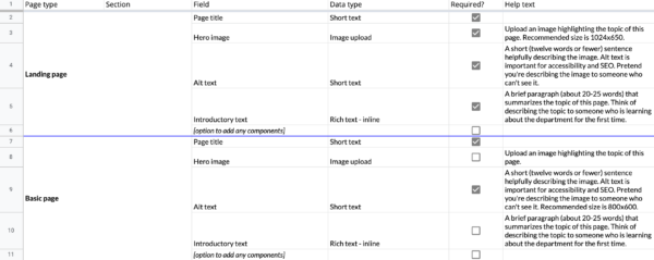
Instead, you can create a customized authoring experience using tools like Advanced Custom Fields (ACF) or the suite of tools that Pixo’s lead web developer Jason Rambeck talked about in his article, “How to bring modern development best practices to WordPress.” This approach lines up well with more content modeling. At Pixo, our content strategists work with content authors to identify what they need, then create a content model outlining the exact data fields and content types they’ll use. We also write custom help text for these fields to guide authors in creating content that looks good and functions well, with recommendations like character length and image size. This leaves a lot of room for authors and editors to do everything they need, but it poses less of a risk of overwhelming them with unnecessary options.
Conclusion
We usually spend a lot of time thinking about the experience that we’re creating for our readers, and that’s a good thing. But if we don’t also pay attention to the experience we’re creating for our authors and editors, then that big, beautiful site we launched may languish and go stale as the people responsible for it struggle to figure out how to do anything with it. We understand how important it is to make it easy for our external users to succeed. It’s time we made it just as common to do the same for internal users, too.
Need help setting up a content workflow?
Our free guide to content roles can help your team get going.