Defining fluid typography with static design mockups
The gap between mockups and final designs
For web designers, the chasm between static mockups and the final website has always been vast. It’s a lot like the path from concept art to a completed film; the artist creates a painted vision for what they hope a particular scene will look like, but it’s impossible to account for the actual motion that will eventually define it. Websites are living, moving, and ever-evolving entities, while design mockups are momentary, simple, static paintings.

Modern design programs help
Of course, we’ve seen great strides over the past several years when it comes to bridging that gap with different design programs, but there will always be a leap to make between the initial vision and the final product.
Introducing fluid typography
We at Pixo recently introduced fluid typography to our web design process. Responsive web design has always been a passion of ours, so with the emergence of fluid type, we were eager to try it for ourselves.
If you’re not familiar with fluid type, I’d encourage you to read Christine Vallaure’s article, “How to create truly fluid typography online.”
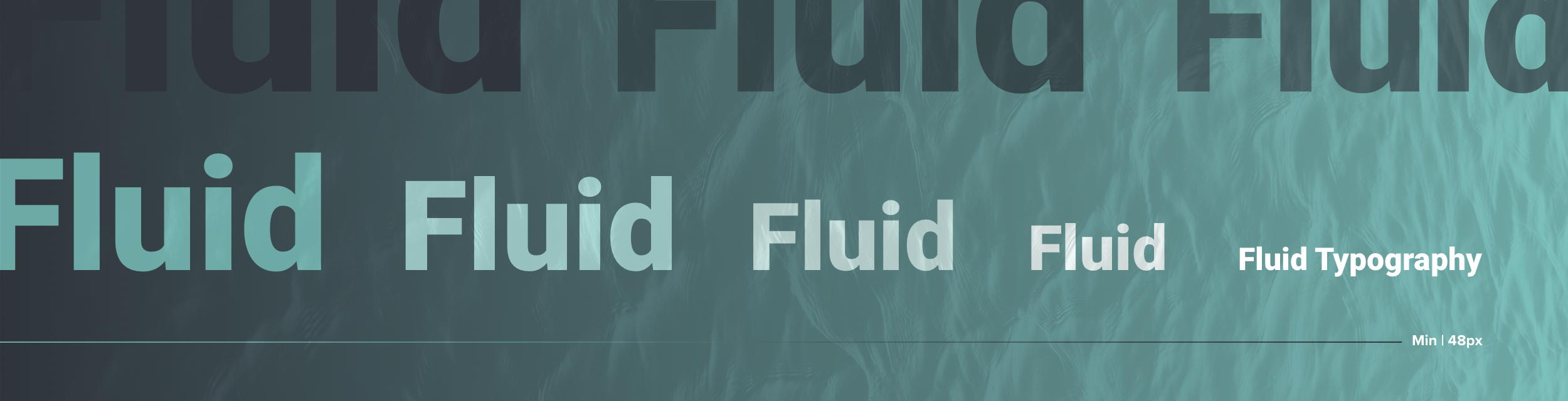
In short, fluid typography uses viewport width (1 vw = 1% of the viewport width) to automatically adjust type size to the width of the viewport itself. Where we traditionally defined different type sizes for different viewport breakpoints, fluid type allows us to set a maximum type size at the widest break point and and minimum type size at the narrowest. This allows the type to grow and shrink “fluidly” as the viewport width changes.
Fluid type drastically reduces the additional work we once put into defining every type size for every break point. It also gives us greater certainty that the hierarchy of typography on our websites will be accurate across any device.
How to communicate fluid typography with a non-fluid art board
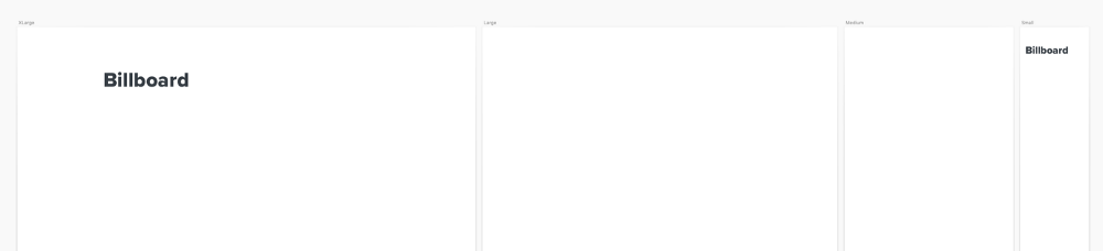
When I’m designing a website, I usually compose each component with four different viewport widths…
- Extra large (2128 px wide)
- Large (1648 px wide)
- Medium (784 px wide)
- Small (320 px wide)
But those widths aren’t fluid, they’re just landmarks for an infinitely elastic web. I need to capture each detail with a static image if I’m going to accurately communicate the design vision to our engineers. So, how can I express the use of fluid typography across four static art boards to our engineers?
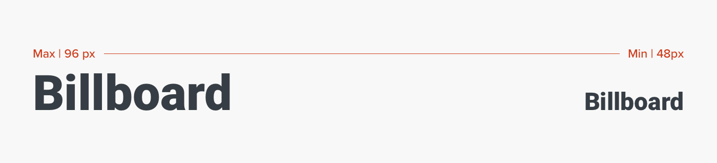
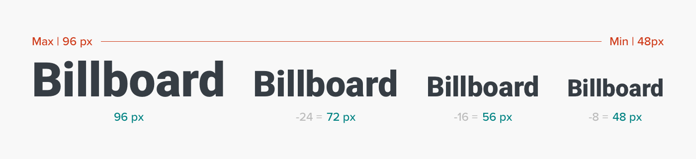
Define the type style’s max and min sizes
First and foremost, we need to define the maximum and minimum sizes for the type style.
For example: this type style should be no larger than 96 px on the widest viewport and no smaller than 48 px on the narrowest viewport.
Let’s use this type style that I’ve named “Billboard” as an example…
Sizes between extra large and small
Great. We did it. Fantastic. Apart from defining the widest and narrowest breakpoints, your fluid type is practically ready for implementation.
But hold on…
You’re the graphic designer. If you’re like me, these sizes only account for your extra large and small art boards. What about everything in between?
Build variations
All that fancy math on the web will do the work for you when it’s live, but you need a way to build responsive variations of your design in the meantime. So, we need to create some additional sizes for “Billboard.”
I typically work in multiples of 8. You may be a multiples of 5 kind of person, or a prime-numbers-only kind of psychopath. Whatever system works for you, this is the time to apply it. Find the appropriate fractions of your typeface within the scale you’ve already defined.
Develop a system for organizing the variations
Alrighty then, now you can use this typeface for your large and medium art boards as well.
Ahh, but wait a minute…
That may have solved YOUR problem, but now you’ve added complexity for the engineers. Just imagine the Slack messages…
“Hey, I’m looking at the ‘large’ art board of this component. Billboard is 72 px instead of 96 px. Is that the max size now? What’s going on?”
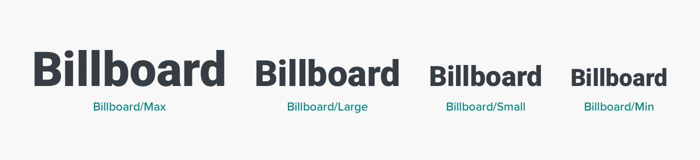
We need a system for properly naming our type style variations that communicates which size is the max, which is the min, and which is the static representation in between.
Organizing Your Fluid Typefaces by Name
I’m using Sketch for this example, but the labeling system I’m proposing is just as useful for Figma and XD.
When adding these fonts to your type style library, try using this format:
Billboard/Max
Billboard/Large
Billboard/Small
Billboard/Min
Communicate your methods with engineers
Make sure your engineers know that this will be the system to follow. They should include specs of type style that end in “/Max” or “/Min.” They can ignore any type style that ends in a descriptor like “/Large” or “/Small.” Those are for you and your static mockups.

Use art boards
This system should enable you to keep your type styles organized as you apply them to multiple static viewport widths without drowning your engineers in a sea of font specs.
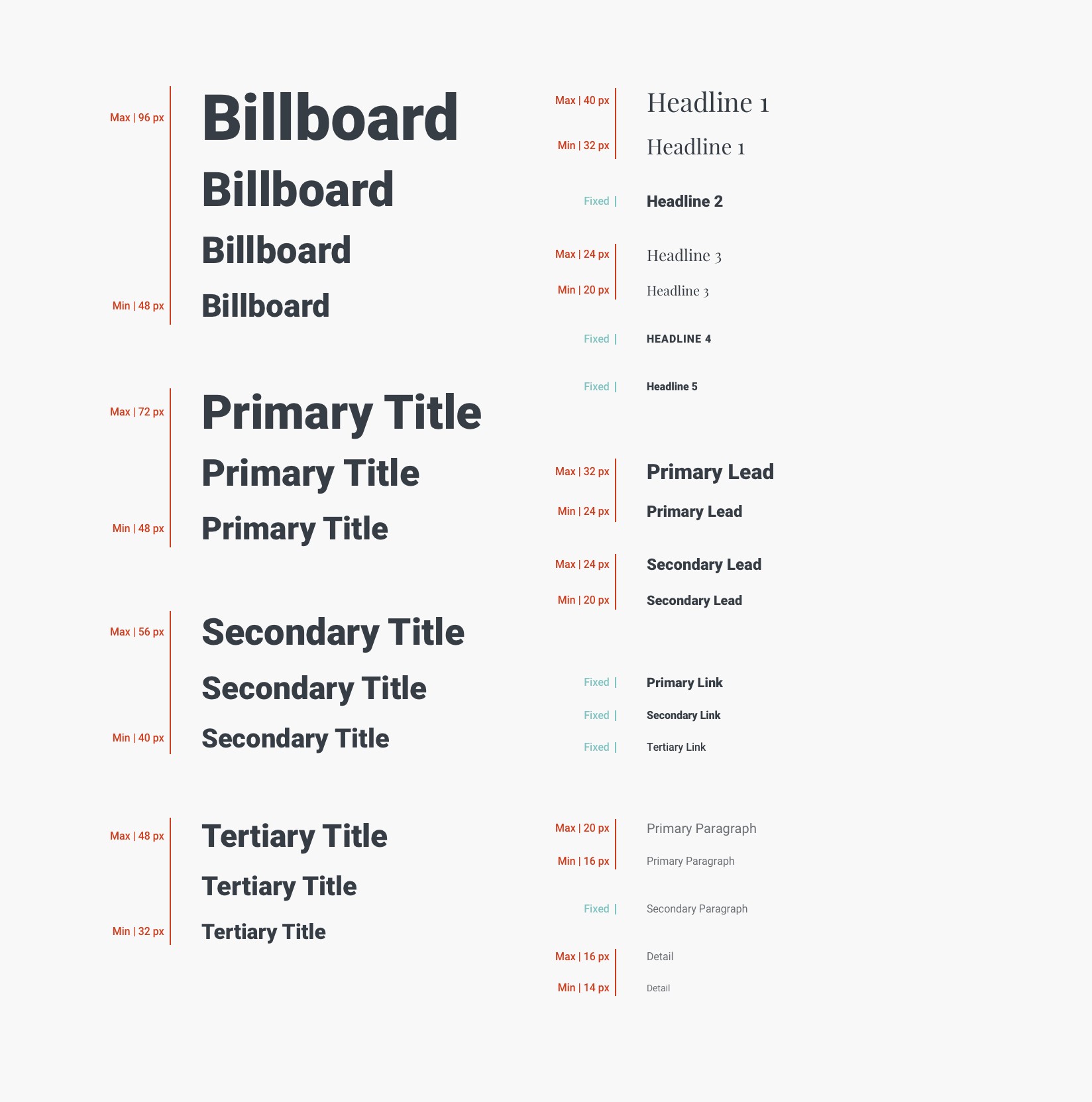
One additional way to level up your type organization is to make a separate art board with all of your type styles listed out. Most inspectors (Zeplin, Sketch Cloud, Figma) will organize these styles for you, but the specs are not always paired with their visual form. Making a complete type style sheet will serve as a helpful guide for communicating with your engineers. Here’s an example from a project we recently completed.
Collaborate with engineers
Define the breakpoints with your engineers
As your team of engineers begin to apply these styles to the web, you can work with them to define the individual break points of each type style’s max and min sizes. When will the text’s transformation begin and end? At what viewport width will the maximum size begin to shrink, and when will it stop transforming at its minimum size?
Try it for yourself!
Here’s a Sketch file that includes all of these type styles with their appropriate labels, along with my responsive web design template with four different viewport landmarks. I hope it gives you the foundation you need to try it yourself!
Fluid Type Styles Sketch Template
I’m using Roboto and Playfair for the template, so make sure you have those babies cued up before you open the file.
Remember, designer…
You are the concept artist. It’s up to you and the engineers to make your team’s vision a reality on the web. Bridging the gap between static mockups and responsive websites can be challenging, but don’t let that leap keep you from the innovation you aspire to.