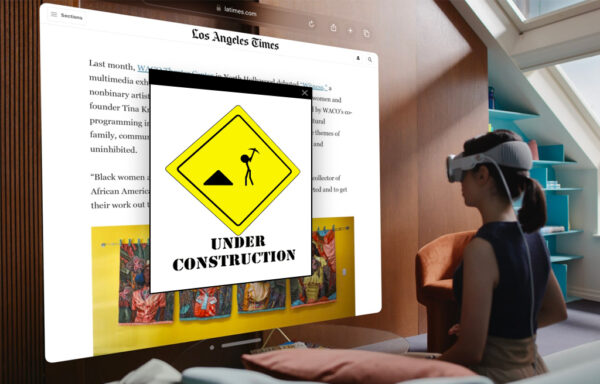
Is your website ready for the spatial browsing era?
The rise of AR and VR headset tech has been a novel trend to follow
The rise of AR and VR headset tech has been a novel trend to follow over the last decade (remember Google Glass? Right?), but with Apple’s announcement of the new Vision Pro, it seems that the “spatial computing era” has finally dawned. Even with its staggering starting price ($3,499), it’s not unreasonable to think that more and more people will begin to access your website through a headset rather than a screen. So, what design practices should you employ to help equip your website for the era of spatial browsing?
Fluidity
First and foremost, the onset of a new browsing device demands our websites to be all the more fluid. How well does the content and composition of your design respond to the size of different containers?
The way we view the web was irrevocably transformed with the introduction of mobile web browsers in the late 2000s. Where we could once bank on most screens being roughly the same size rectangle, smartphones and tablets required our websites to now squeeze down into a pocket-sized portrait. Thankfully, web designers and developers have spent well over a decade innovating on the practice that Ethan Marcotte once coined as “responsive web design.”
Now, with Apple’s Vision Pro, folks can take your website and stretch it to whatever size they darn well please, whether that’s to the width of an IMAX screen or down to a speck in their eye. So, how can you make sure that your design will respond best to such a fluid frame?
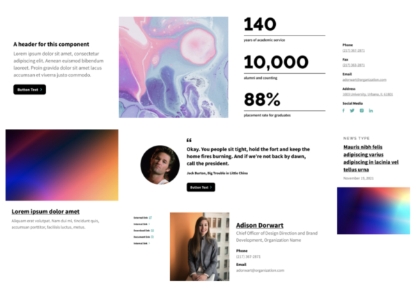
Keep pressing into component-based design. This is the method of grouping the content of your website into modular structures that can stack and stretch to fit any kind of space. When we build our websites with these smaller, individually responsive blocks, your pages will become far more equipped to browse on any device—from goggles to glass.
Lean on modern responsive tools
Lean on modern responsive tools like fluid typography, variable fonts, and viewport-based spacing. Don’t relegate your design to pixel perfect dimensions. No matter how hard you try, you won’t be able to control how your design will render at every viewport width. The outcomes are endless.

Finally, be concise with your content.
Finally, be concise with your content. The less you choose to include on your website, the less you have to restructure according to the viewport. Prioritize shorter, clearer, and more impactful ways to communicate what’s most important to your audience. If you’d like some help, the Hemingway app is a great tool for chopping down lengthy messaging.
Accessibility
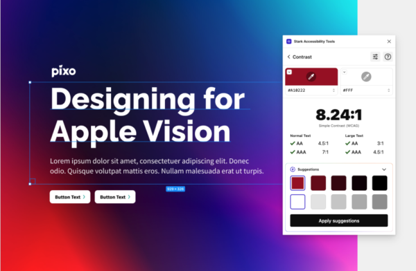
Prioritizing the visual accessibility of your website’s design is always important, and that couldn’t be more true for the era of spatial computing. As we design for a device that is inherently vision-based, we must ensure that our websites are as perceivable and operable as possible for those with diverse seeing abilities. So, here are a few core accessible design practices to help you build a more spatial-friendly website.
Ensure that there is enough contrast between the colors on your website. You can use tools like Stark to see how your color combinations fare on the WCAG accessibility scale.
Don't use color alone
Don’t use color alone to communicate important information. Make sure key content is equally emphasized by labels and other graphic elements.
Structure your design with a clear visual hierarchy.
Structure your design with a clear visual hierarchy. On a device that practically bathes your eyeballs in content, make sure your pages are as scannable as possible. A simple way to accomplish this is by starting each section of a page with larger, readable headlines and separating those sections by an appropriate amount of white space.

Prioritize larger type styles.
Prioritize larger type styles. No matter where a person lands on the spectrum of seeing ability, using larger type is a simple and effective way to improve the readability of your website.
For more accessible design tips, here’s a great article from Elementor.
Interactivity
Finally, the interactivity of your design will play an important role in the era of spatial web browsing.
As Apple’s announcement video clearly shows us, Vision Pro users will primarily navigate the web with their eyes. Seriously. Their eyes. Where we can now use a cursor to activate some hover state on an actionable element, we will soon be using our line of sight to do the same thing. So, those affirming visual interactions on “clickable” items will be all the more imperative.
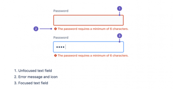
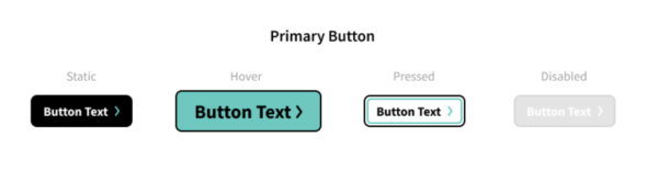
Make sure to establish identifiable hover, pressed, and visited states for all buttons and links on your website. It should be immediately clear to a Vision-user that they are looking at the right button in the right place on your page.
Keep your interactions simple.
Keep your interactions simple. They are meant to improve focus rather than detract from it. Don’t let cool effects become annoying obstacles.
Make sure your interactions are predictable and understandable. If one of your site visitors looks at a button and it shrinks in size rather than scales up, they may be prone to look past it.
The web changes, but core design principles remain
The era of spatial computing will undoubtedly transform the way we browse the web (until we inevitably arrive at some Ready Player One kind of internet), and with the existence of Apple’s Vision Pro, there are so many web design innovations on the horizon as well. In the meantime, if we stick to these core web design best practices, we can confidently usher our websites into the new era.