Inclusive color palettes for the web
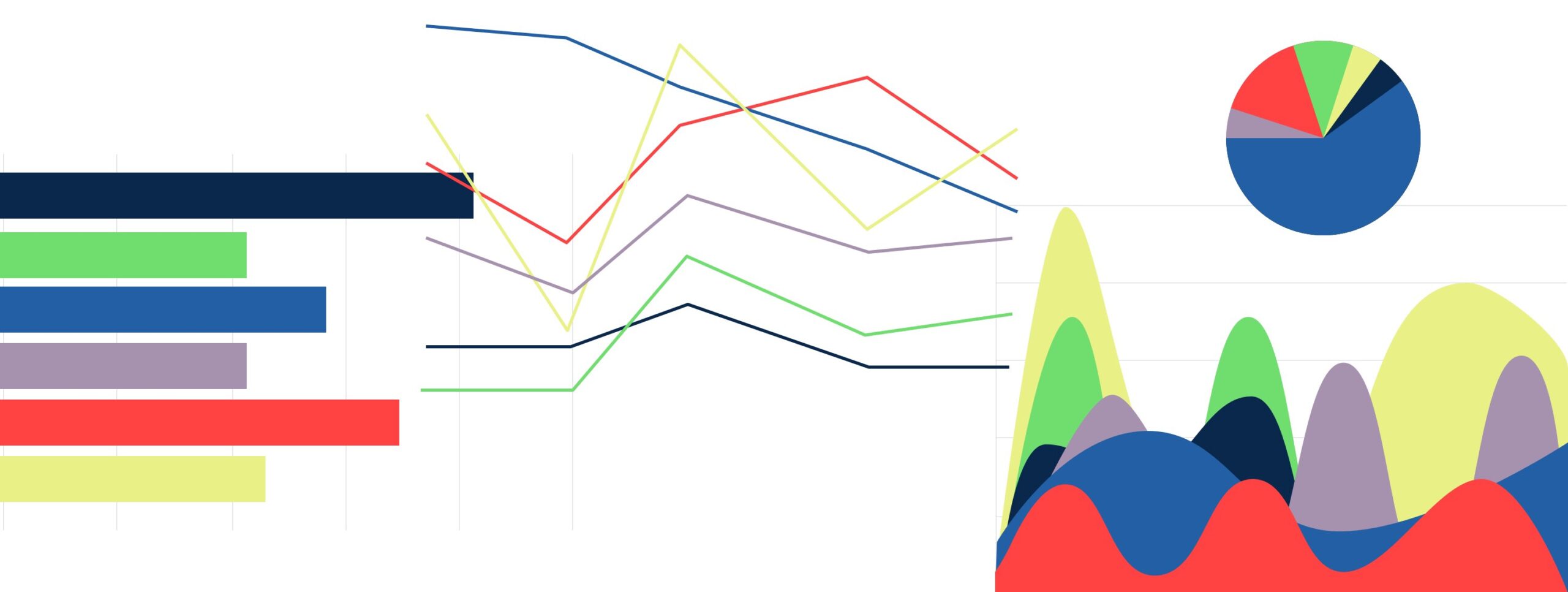
Data visualizations
While it’s common practice at Pixo to check color contrast for optimal readability, we don’t always prioritize comparing each color’s distinction from one another. But color distinction becomes a high priority when designing data visualizations, which rely on the variations between color to represent different categories of information.
Designers might strive to make this color distinction clear for viewers who perceive colors in a similar way, yet this “one size fits all” approach doesn’t take into account all color vision experiences.
To create truly inclusive software, we need to ensure our color palettes are designed for all types of viewers.
Prevalence of color blindness
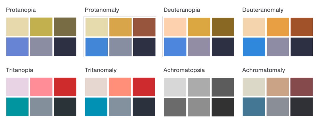
According to the National Eye Institute, there are three main types of color blindness: red-green, blue-yellow, and total color blindness. The most common type is red-green color blindness (protanomaly, protanopia, deuteranomaly, deuteranopia). Blue-yellow and complete color blindness are rarer (tritanomaly, tritanopia, cone monochromacy, achromatopsia).
As many as 8% of men and 0.5% of women with Northern European ancestry have the common form of red-green color blindness.
My challenge
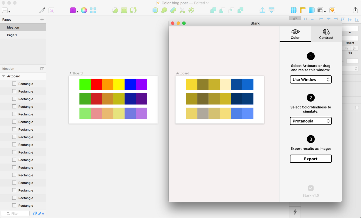
For a particular data visualization project at Pixo, I turned to the web in search of some existing color palettes for data visualization that were distinct enough for all types of color vision experiences. Overall the options were disappointing and not always visually complementary.
I had my challenge. With some preliminary research, a blank Sketch file and a plugin called Stark, I set off to create color palettes that were visually appealing and inclusive to all viewers.
A breakdown of requirements for a palette that works for all
The criteria:
- There must be 6 colors in each palette.
- Each color must be visually distinguishable from one another for each of the 8 color blindness deficiencies: protanopia, protanomaly, deuteranopia, deuteranomaly, tritanopia, tritanomaly, achromatopsia, achromatomaly.
- The colors in each palette should be both distinct yet visually appealing for all viewers.
The inclusive color palettes
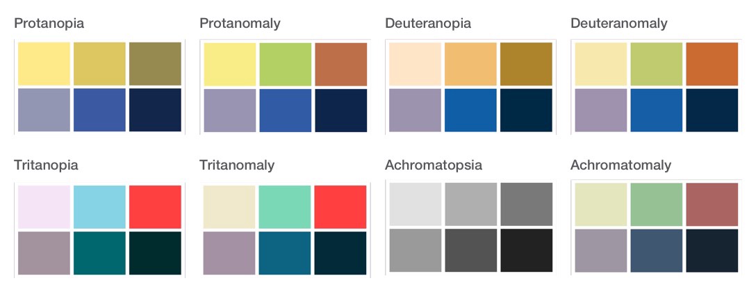
Palette 1
#E8F086, #6FDE6E, #FF4242, #A691AE, #235FA4, #0A284B
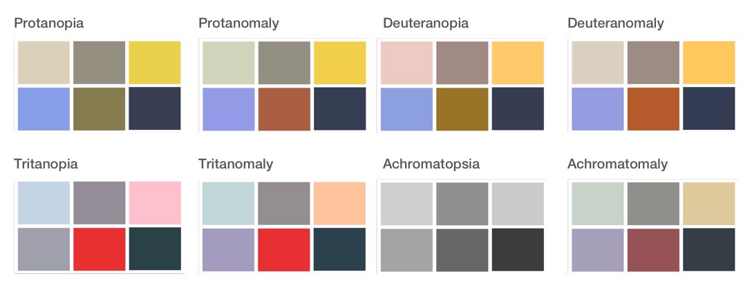
Breakdown of inclusive color palette #2
Palette 2
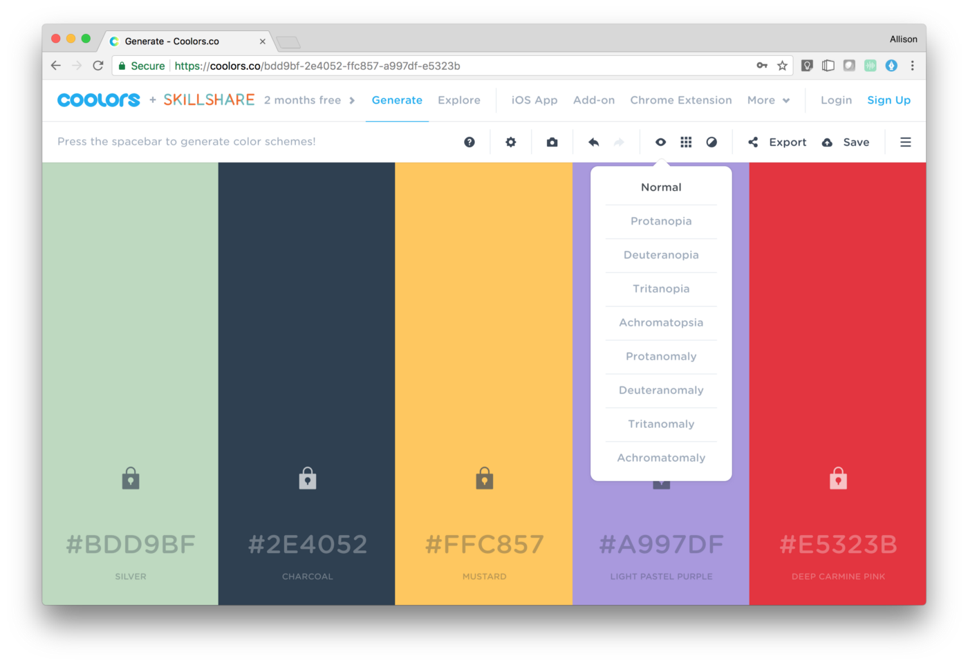
#BDD9BF, #929084, #FFC857 #A997DF, #E5323B, #2E4052
Breakdown of inclusive color palette #3
Palette 3
#E1DAAE, #FF934F, #CC2D35, #058ED9, #848FA2, #2D3142
The Takeaways
- Whenever I ran into two colors looking too similar, I found it was because their contrast levels were very similar.
- The trick for using red and green together is making sure there is a strong variation in contrast levels. For example, I used a very vibrant highly saturated green and a muted red.
- Along the way I found that Coolors.co has a wonderful feature for changing between color blindness deficiencies.
Next steps
This is just the beginning of my inclusive color palette work; I hope to gather feedback on the success of these from varying users with color blindness. In the meantime, I would love to hear about your own challenges, tools, and success stories when creating accessible color palettes for the web!