More than pretty: How effective visual design goes beneath the surface
Introduction
“…and then the designer will just make it pretty, right?”
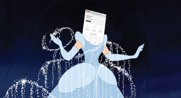
I can’t tell you how many times I’ve heard those words when designing a website. “Just make it pretty.” That’s the visual designer’s role, right? Where UX designers learn how to successfully engage users and engineers write code to bring a website to life, visual designers steal away for a bit to get Cinderella ready for the ball.
Now don’t get me wrong — creating something so visually stunning that it grabs the prince’s attention is certainly part of the job. But when we assume that design only concerns the look of a website, we stand to miss out on so much more.
Consider your current website. You may be perfectly content with how it looks, but is it accomplishing the goals your website exists to achieve?
At Pixo, our visual designers go beneath the surface to create websites that are far more engaging, usable, and expansive. But what kind of impact can effective visual design have when we are unwilling to settle for “pretty?”
Visual design engages your audience
The very first interaction that many visitors will have with your website is visual. They will immediately respond to how it looks. This is why we can become so concerned with making it pretty in the first place. Does your current design grab the attention of your users at first sight? That may be true. But more importantly, does it keep their attention?
Design with the audience in mind
Effective visual design can better engage your target audiences by designing with them in mind. Our designers work with you from the very beginning to understand who your audience truly is. We partner with UX designers and content strategists to interview future site visitors and better understand their needs, their concerns, and their goals. We seek to know which peer websites they’re most drawn to and why. We invite audience members to interact with prototypes early and often, gathering their feedback and adjusting the design according to their input.
After introducing our third child to the family this past year, we were ready for a car that could meet our expanding needs. As my wife and I shopped around, we saw plenty of really slick cars to choose from; great colors, cool styles, gadgets galore. But what we ultimately purchased was a car designed with our needs in mind: a minivan! Is it cool? I don’t know — It’s gray, and it’s a minivan — need I say more? And yet, every time I drive that car, I think to myself (and often out loud), “Wow, this is just perfect for our family!” That’s the impact of audience-focused, effective visual design.
Connect your audience with your own visual identity
Another way that design can engage your audience is by capturing and elevating your organization’s visual identity.
Your brand wasn’t designed to simply look good either. It was created to communicate the unique character of your organization to your audience. It expresses something about your values, your services, and your products that sets you apart from the rest. In our digitally connected world, your website will serve as the primary visual introduction to your brand. If you hope to connect with your audience in an authentic way, then your website should be a natural and engaging extension from your brand.
To do this, our designers become students of your visual identity. We seek to understand where we need to hold the line and where we can push the boundaries. We work within your existing guidelines to create something that’s both uniquely captivating and truly you.
One particular way we accomplish this is through a tool we call “design palettes.” A design palette is a collage of styles — such as colors, typography, and buttons — that serve as the visual DNA for the entire website. Those styles are influenced directly by your pre-existing brand and reorganized for the web in a way that engages your audience.
During this process, our designers and the client work together to determine which collection of styles best represents your organization and your vision for the website. Collaboration is critical here. No one understands the true character of your brand other than you, the client. To define these styles apart from your help will only result in a pretty disengaging experience.
Visual design enhances the user experience
When creating websites, it’s safe to say that all design should contribute to improving the user’s experience. Visitors are using your website to accomplish a goal, right? So when visual design is only concerned with the look of a website, we limit our user’s ability to accomplish their goals.
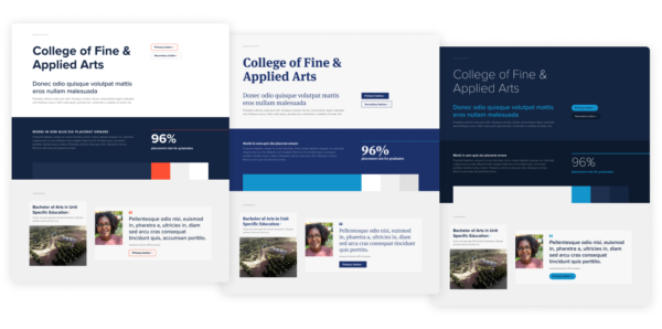
Hierarchy
Hierarchy
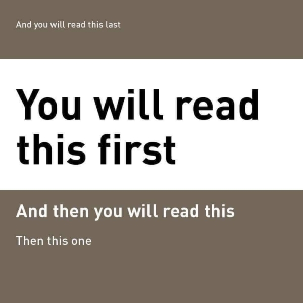
One way that visual design can enhance the user’s experience is by establishing visual hierarchy. Effective visual design can direct our eyes to focus on priority content first. The image shows an example of how this works. You may look at that example and think “what kind of magic is this?” It feels like an optical illusion, right? Our minds are wired to process big-picture visuals faster than written content. If we give the right visual emphasis to blocks of text through color, type size, spacing, and composition, visual design can ensure that site visitors will engage with the right content in the correct order.
Visual design enhances the user experience part 2
Consistency
Designers can improve the user’s experience through establishing a visually consistent system of user interface elements, page types, components, and other design patterns. When similar design elements look different from section to section, users are forced to re-learn what those objects do each time they encounter them. When a user first learns how a particular component works, they will expect it to function in the same way the next time they see it. However, if that component looks different on another page, their initial understanding is questioned. For example, if your website has three different button styles that are used interchangeably as a “primary button,” your users may become confused about what each style communicates. To press a button on a website is a definitive act, and when those buttons are inconsistent, it will reduce your user’s confidence to engage with them.

Visual design enhances the user experience part 3
Accessibility
Visual design also shoulders the responsibility of ensuring that the website is visually accessible, as well. All people will not engage with your website in the same way, especially those who are visually impaired. When we focus solely on the “look” of our websites, we may alienate a large population of our users.
Effective visual design takes their needs into account and works to offer a similar experience for all. At Pixo, our designers accomplish this by ensuring that all text meets contrast requirements, that content can be increased in size according to a user’s preference, and that compositions are structured in a way that allows screen-readers to naturally communicate a page’s content.
But designing with accessibility in mind doesn’t mean that our website must sacrifice a pleasing visual experience. These two things must never be at odds. When we keep accessibility at the forefront of our decision making, effective visual design can meet the needs of all users while maintaining the right visual impact.
Visual design empowers growth
Effective visual design will empower your website to grow. At Pixo, we recognize that websites are living things — they’re always changing and expanding depending on the needs of their users and the organizations they represent. If we treat our website’s design more like a work of art rather than flexible patterns, then the overall look will begin to fragment and break down as the website inevitably grows. Enter: design systems.
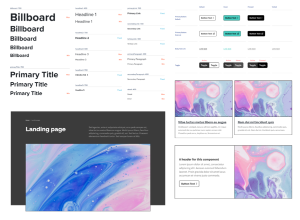
If you’re new to the concept, design systems are a collection of styles, components, compositions, rules, and guidelines for designers and engineers to abide by as they build websites that can grow.
At Pixo, developing a design system is essential to creating a scalable website. Our designers work in collaboration with our clients, UX designers, content strategists, and engineers to appropriately define these styles and guidelines in a way that ensures a website’s longevity.
This process begins with developing a cohesive “design language.” We organize colors, typography, and UI elements that can be coherently applied across the website. We also establish guidelines for those styles to ensure that they maintain the same visual unity as they merge with varying forms of content. No matter how many pages or components are added to the website, the same thread of compelling visual design will tie it all together.
Visual design empowers growth part 2
When creating design systems, we also give special attention to the author experience of our content management systems (CMS). As you, the website author, create and edit your content, those UI elements, components, and page types are accurately represented on the back end. It’s like building with legos. All of the pieces and instructions are clearly defined so you can enjoy the building process.
Take your design from the ball to happily ever after
After reading all of that you may be tempted to think, “What’s your problem with pretty? Do your websites even look good or are they just utilitarian?”
I have no problem with pretty. Our designers strive to create elegant, impactful, striking, and down-right gorgeous websites. But true digital beauty is found in the complete package. When design fixates on the look alone, your website will inevitably fall short of its goals. Effective visual design doesn’t just turn heads; it will get Cinderella to the ball, capture the room’s attention, leave the right slipper behind, and usher your audience into happily ever after.