Have a project in mind? Get in touch.
Let's talk about your projectOOUX-led website redesign for education advocacy nonprofit
Summary
E3 Alliance is a data-driven education advocacy collaborative based in Central Texas. They facilitate and support the work of educators and other local non-profits to ensure that every child succeeds and their community is economically prosperous. Confusing structure and content mired their website’s user experience—in part due to inconsistencies in how they communicated about their work and its value. We collaborated deeply with client stakeholders and customized our design process to leverage object-oriented UX to streamline and showcase their essential content.
The challenge: picking up the pieces after a prior redesign effort fell flat
E3 came to us after being burned by a previous attempt with a different consultancy. They told us they didn’t feel heard, and that the previous consultant was applying cookie-cutter strategies that didn’t solve their problems. We could see that their website’s biggest problem was a lack of clarity. But more than that, E3 stakeholders struggled to communicate what they do and how they do it in a way that the average person could understand.
We knew that this wasn’t a standard website redesign. We needed to get E3 Alliance team members to come to an agreement about how they talk about themselves, their work, and their accomplishments.
We needed to pull apart this big tangled system and simplify it for their target audiences:
- PK-12 admins
- Post-secondary admins
- Community partners
- State policymakers
Additionally, because of their experience with a previous vendor, we suspected that a standard discovery, design and development plan might not cut it.
The solution: level-setting through a customized, collaborative OOUX design approach
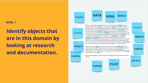
In addition to our standard stakeholder and audience interviews, we decided to employ a new strategy that seemed like a perfect fit for this particular problem. OOUX stands for Object Oriented User Experience and it is a design process that encourages codesigning with the client. By following the OOUX process, we essentially went through requirements gathering, journey mapping, and wireframing with the clients providing hands-on help. Doing it this way was efficient because it required less heads-down design time later on, and it encouraged a lot of discussion.
During our OOUX sessions, we were also able to establish a shared definition of each facet of E3’s public-facing work and come to an agreement on the best language to explain them to their core audience.
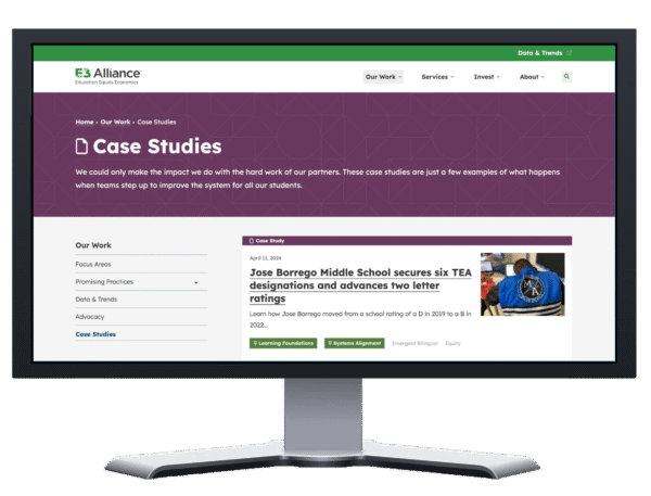
Structured content
It became clear during our OOUX session that two of their content types—focus areas and practices—needed reigning in. These were the pieces of the E3 strategy that were most difficult to articulate. Pixo suggested structured content to establish consistency in both content and design. This way, no matter who added new focus areas or practice pages in the future, they would stay aligned with the core strategy. The CMS would have built-in parameters that would push E3 authors to resist internally oriented content and focus only on the pieces of information that we know users want and need.
Connected content
In addition to adding structure to their new website, we added ways to connect content. We know this is good for SEO, but we also wanted to provide inroads for new site visitors to dig in and explore. We provided structured components for resources such as videos, PDFs, and data visualizations. The data cards component allows E3 to connect to their data portal, which is one of their audiences’ core needs. Now, they can draw clear connections between data and other facets of their work. The component is also more accessible than the previous way they shared data.
We also employed a way for them to turn on a section at the end of their pages to connect with related articles and practice pages elsewhere on the site.
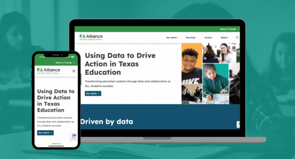
The result: an inviting, intuitive new site that is easy to navigate and maintain
Pixo took a nontraditional approach to discovering and designing E3 Alliance’s new website, and it paid off. The site is easy to navigate because each piece of their strategy is represented clearly and connected thoughtfully. There is no more unnecessary filler content because every page is intentional.
But more importantly, E3 has gained a communication framework for their organization that will have a bigger impact than any website.
“You got somewhere with this in 30 minutes that we have spent months trying to get across to another agency. You all are so clear about what you need! We really appreciate you including us in the project planning and the day-to-day stuff!”
– Kaci Kai, (now) Senior Director of Communications, E3 Alliance