Off the charts: Making data visualizations accessible

Off the charts: Making data visualizations accessible
Now more than ever, we’re living in a data-driven world. Dashboards and databases have become indispensable tools for business and nonprofit ventures alike. Companies and organizations are not only generating unprecedented volumes of data, but also leveraging it in new ways to drive important decisions.
Data visualizations can be great tools for making key data more digestible—but what about accessible?
Web accessibility is itself a force that’s significantly (and welcomely!) reshaping the online landscape, accelerated in the United States by the DoJ’s landmark 2024 ruling and globally by the European Accessibility Act.
Charts and graphs are inherently visual, and their meanings are often complex. Most can’t be adequately summarized with basic alt text. (And if you want them to be dynamic or interactive, swapping in a static image is beside the point, anyway.)
As longtime champions of web accessibility, Pixo is well-versed in making many types of content accessible—including data visualizations.
Here are a few accessibility best practices for digital charts and graphs, illustrated with examples from our own work. (Note: we’ve obscured some information for client privacy.)
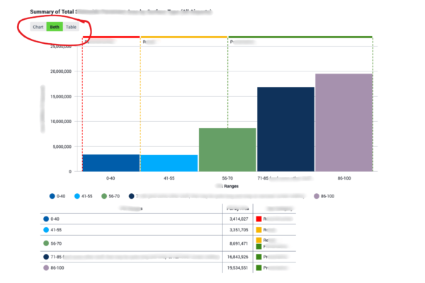
1) Put everything out on the table.
No, really! A good old fashioned table of your data ought to accompany any other type of visualization.
Adding a table provides multiple ways for people to perceive information. But more than that, tables (when set up correctly) are particularly screen-reader friendly because they present information in a linear fashion, i.e., they can be read from top to bottom and left to right.
In the example below, we’ve built a toggle feature that allows the user to choose whether to display the table, chart, or both:
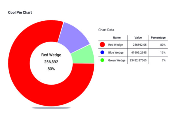
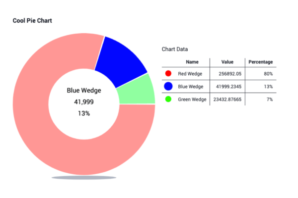
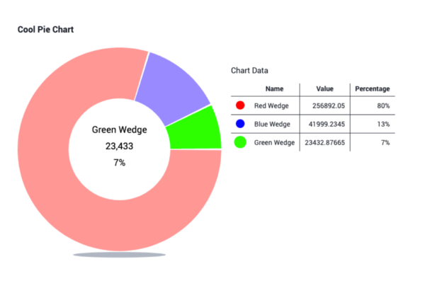
2) It takes two—or more.
When relying on visual attributes to convey meaning, always include more than one, such as size, color, shape, or motion. This ensures that a user who may be limited in perceiving a certain attribute—for example, someone who is color-blind—can still interpret the information.
Here’s what’s at play in our example donut chart below:
- Color: The three segments of the donut are bright, distinct colors, contrasting with each other and their background.
- Transparency: Only the selected segment of the donut appears with full opacity, while the two non-selected segments have a transparency effect applied.
- Size: When a segment of the donut is selected, its corresponding colored dot in the table increases in size.
- Text labels: All of the data associated with each segment of the donut appears in the center when a segment is selected.
3) Aria all the things!
For those familiar with image alt text, aria-labels are similar in that they help assistive technologies interpret visual information.
A key difference is that aria-labels aren’t limited to (or located within) <image> tags; they can be applied to any element on a web page, such as a button, link, widget, or iframe. (Fun fact: “aria” is an acronym for “Accessible Rich Internet Applications.” This video provides a more detailed overview.)
Keep in mind that when both an aria-label and image alt text are present, many assistive technologies will prioritize reading the aria-label instead of the alt text. (However, some ATs may not support aria-labels at all, so it’s still considered best practice to provide both whenever applicable.)
For our table toggle example in #1, we’ve included aria-labels for each setting, following this formula:
aria-label=“[title of chart] Show Table”
aria-label=“[title of chart] Show Chart”
aria-label=“[title of chart] Show Both”
Likewise, our donut from #2 includes all the content associated with each wedge in their respective aria labels:
aria-label=“Red Wedge. 256,892. 80%.”
aria-label=“Blue Wedge. 41,999. 13%.”
aria-label=“Green Wedge. 23,433. 7%.”
If you need help with databases, dashboards, web accessibility, or the confluence of all three, Pixo would love to connect with you!
Contact us to get started.
Need help making your website more accessible?
Check out our free guide to Web Accessibility Essentials!